The first graph shows the last 7 days of metrics in one go:
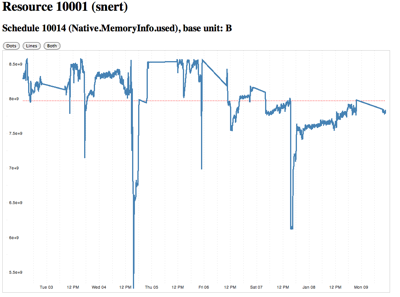
raw_graph.html
This one shows the last 7 days where each span of 24h is represented by a colored line, which allows to compare the values directly - the darker the color, the older the data:
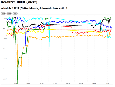
raw_graph7.html
This needs some more work, as the x-axis labeling does not yet take the exact start time into account.
Also time spans that have no values (e.g. because agent is down) should not show a straight line, but no line at all for that period. There should perhaps be a legend about the colors as well.
I am still very much on the learning side of JavaScript and D3.js and the above is far from the beautiful examples Mike Bostock creates, but I think one can already see the potential power here.
If anyone is interested to add tooltips for the values or fix the label for the second graph, please ping me.
No comments:
Post a Comment